First steps for presentation and analysis of calcium imaging data
Posted by Andrey Andreev, on 6 September 2022
Andrey Andreev, Desiderio Ascencio
California Institute of Technology, David Prober lab
aandreev@caltech.edu
Calcium imaging is a widely used tool in neuroscience, and our community now has access to multiple computational tools to process and analyze these data. However, a significant portion of work with imaging data relies on much simpler approaches than offered in these software packages. Correlation with stimuli or behavior, detection of periodic activity, dimensionality reduction, and other basic approaches can be straight-forward for researchers seasoned in data analysis, but unfamiliar to a larger community of experimental neuroscientists. Here we provide examples of such analysis using Python language together with sample open-access datasets. We show how some of these questions can be addressed with standard algorithms and offer documented Jupyter notebooks ready to be adapted for other data.
Code (split into 2 Jupyter notebooks) and data can be downloaded from Caltech Research Data Repository following link DOI 10.22002/D1.20282.
Imaging methods:
Imaging data for the first notebook comes from imaging spontaneous activity in pallium of 6dpf (days post-fertilization) zebrafish larvae, expressing nuclear-localized calcium indicator, Tg(HuC:H2B-GCaMP6s). Imaging was performed using a custom single-photon light-sheet microscope. Data for the second notebook was collected using two-photon capability of our light-sheet microscope in 5dpf zebrafish larvae Tg(HuC:jGCaMP7f). We use 650nm LED to elicit visual response. Light-sheet microscope was constructed following previously published design (Keomanee-Dizon, 2020).
Notebook #1: Working with single-cell calcium imaging data
Calcium data analysis usually comes down to several specific questions. To name a few, we might want to know which cells respond to stimuli; what are the characteristics of activity (amplitude of response or frequency of periodic activity); which cells are activated together or show similar activity patterns. As we mentioned in a previous article “Biologist’s checklist for optogenetic experiment”, scripting of data analysis can increase fidelity and reproducibility of the results. Using python and Jupyter notebooks is a great scripting solution for biologists. However, general programming literacy still remains low within the biological community, as surveyed among students (Mariano, 2019) and even microscopy specialists (Jamali, 2021). Here we provide concrete examples of calcium imaging data presentation and analysis through Python scripting performed in Jupyter notebooks, hoping to demystify that process and provide a convenient “sandbox” for learning.
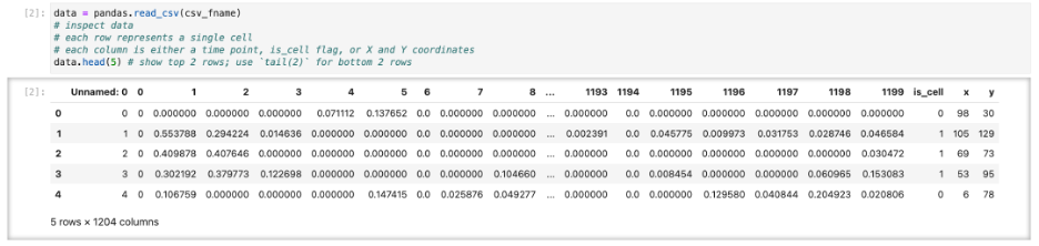
We start by looking at calcium imaging data that has been segmented to provide locations of neurons and activity traces. Here we don’t focus on how exactly such segmentation was performed. There are multiple packages (Suite2P, CaImAn to name just two) and going in-depth requires separate discussion. We assume you have already segmented images and extracted data in some suitable format such as CSV file of traces and locations (Figure 1).
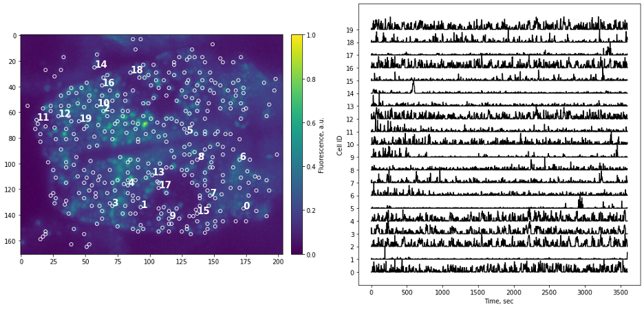
Simple as it seems, but the task of presenting raw data should be done carefully and with attention to detail. “Letting the data speak for itself” is hard when plots are hard to read, or presentation is confusing. If the main point of data presentation is to show presence of patterns in the activity of the cells, displaying normalized traces might be sufficient. Normalization by setting minimum value to 0 and maximum value to 1 (or “squishing the trace between 0 and 1”) allows convenient stacking of the multiple traces on a single plot. If the number of traces you display is small (or if you are aiming to show small subset of all traces) it might be informative to point to actual locations of each cells by adding labels to the original image.
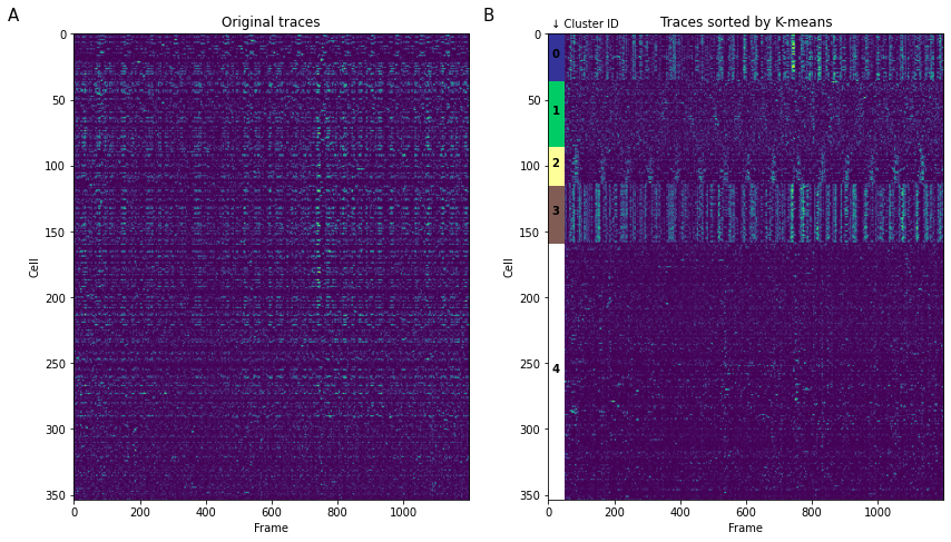
When we want to present all segmented traces, “heatmap” is the tool of choice. However, it can be hard to comprehend data when traces are randomly sorted (Figure 3A) as is often the case with segmentation algorithms. A simple, but non-quantitative way to quickly group traces together is K-means clustering (Figure 3B). It can also be used quantitatively in the case of presenting external stimuli (see Portugues, 2014). Be careful using any clustering algorithm: some implementations have different definition of “distance”, for example Python’s scipy.kmeans() provide only Euclidean distance, while in MATLAB implementation of kmeans() also provide a correlation distance function often used for functional connectivity analysis.
Code for performing sorting using K-means (full notebooks linked at the beginning of the article):
# apply K-means clustering to sort activity traces
# Beware: scykit K-means implements only Euclidian distance metric,
# while MATLAB (for example) also implements correlation metric
# Read more: https://www.mathworks.com/help/stats/kmeans.html#buefs04-Distance
# turn temporal activity data from pandas to numerical type
data_t = np.asarray(cells_activity.iloc[:,:]);
plt.figure(figsize=(14,14))
ax1 = plt.subplot(1,2,1)
plt.imshow(data_t)
ax1.set_aspect(4)
plt.title('Original traces');
ax2 = plt.subplot(1,2,2)
Ks = 5
# K-means relies on random number generation, we can fix the seed to have same result each time
centroid, labels = kmeans2(data_t, Ks, seed=1111111)
# argsort outputs indeces after sorting the argument
# so i_labels contains indeces of cells, sorted by corresponding cluster ID
i_labels = np.argsort(labels)
plt.imshow(data_t[i_labels,:])
ax2.set_aspect(4)
plt.title('Traces sorted by K-means');
cmap = cm.get_cmap('terrain', Ks)
# -> Cosmetic code to create a Rectangle patches to label specific K-cluster
Koffset = 0
for Ki in range(Ks):
Nk = np.size(np.where(labels == Ki))
# 40 is width of the rectangle
rect = patches.Rectangle((0, Koffset), 50, Nk, linewidth=1, edgecolor='none', facecolor=cmap(Ki))
ax2.text( 10, Koffset + Nk/2, Ki ,color='k', weight='bold')
# Add the patch to the plot
ax2.add_patch(rect)
Koffset += Nk
ax2.text(10,-5,'↓ Cluster ID',fontsize=10)
# <- end of cosmetic code
# add subplot labels
ax1.text(-200,-10,'A',fontsize=15)
ax2.text(-200,-10,'B',fontsize=15)
ax1.set_xlabel('Frame')
ax2.set_xlabel('Frame')
ax1.set_ylabel('Cell')
ax2.set_ylabel('Cell')
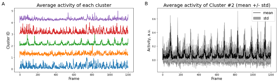
plt.show()K-means clustering and averaging of activity across clusters can be a useful first step to represent heterogeneity of data (Figure 4). The standard way to represent variability then is a “shadow” of standard deviation for each time point. Standard error of mean (SEM) is often used as well, however it has different meaning and can under-estimate variability when the number of samples is large (see Barde, 2012).
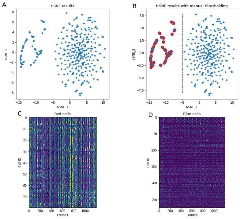
K-means clustering is not the only way to perform splitting of the data into separate groups of similar activity. The embedding technique tSNE is a popular tool to visualize multidimensional data, and often applied to segmented neurons activity. For example, it can provide insight into co-activity of neurons primarily tuned to different external stimuli (e.g. Chen, 2018). Here (Figure 5) we perform tSNE using a fixed random number generator seed (so that every time we run the code result stays the same) and notice separation of cells into two large clusters. Manual splitting by using tSNE_1 = -5 as a threshold allows labeling of cells into “red” and “non-red”.
Code for t-SNE applicaiton (full notebooks linked at the beginning of the article):
from sklearn.manifold import TSNE
# perform t-SNE dimentionality reduction
# t-SNE relies or random number generation, so we fix random_state to have same result each time we run the code
X_embedded = TSNE(n_components=2, learning_rate='auto', init='random', random_state=1113).fit_transform(data_t)
plt.figure(figsize=(14,12))
# plot t-SNE embedding in two-dimentional space
ax_tsne = plt.subplot(221)
plt.plot(X_embedded[:,0], X_embedded[:,1],'*')
plt.text(-20,9,'A',fontsize=20)
# format aspect ratio and axis labels
ax_tsne.set_aspect(1.5)
ax_tsne.set_xlabel('t-SNE_1')
ax_tsne.set_ylabel('t-SNE_2')
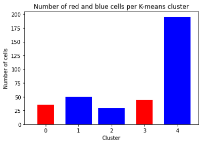
ax_tsne.set_title('t-SNE results')Because tSNE and scipy‘s implementation of K-means clustering both use Euclidian distance metric, results of these methods are connected. For each cell we have a “red/non-red” label, as well as K-means clustering cluster identifier. The histogram of these identifiers for each of tSNE groups shows that “red” cells are not overlapped with “non-red” cells in K-means clustering (Figure 6).
Notebook #2: Pixel-wise analysis
In certain experiments we are either not interested in neuronal segmentation or can’t perform such processing. One example is analyzing visual response in the optic tectum of zebrafish. In that case we perform pixel-wise, or region-wise analysis and work with data that comes from individual pixels of the image rather than individual neurons. Here we present several results of such processing.
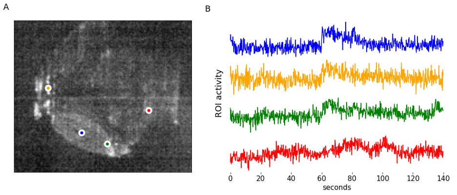
One way to organize data is in a pandas dataframe, which speeds up addressing individual pixels’ intensity profile over time (Figure 7). There may be various reasons to perform a pixel-wise analysis – here we perform a simple experiment with light stimulus and ask which pixels within the optic tectum correlate the most with beginning of the light pulse, and which correlate the most with ending of the light pulse. Similar analysis can be performed for a variety of other stimuli types, including sound (Poulsen, 2021), or grating movement (for examples see Freeman, 2014 or Gebhardt, 2019).
Code to generate GCaMP response model (full notebooks linked at the beginning of the article):
def modelOnset(tau=200, phase = 300, n=700):
    # pre-allocatre memory with empty array of zeros
    onset_model = np.zeros(n)
    decay = lambda t: np.exp(-t/tau) # exponential decay

    vfunc = np.vectorize(decay)

    # in our experiment LED turns on at frame phase = 300
    onset_model[phase:] = vfunc(np.array(range(phase, n)))

    return onset_model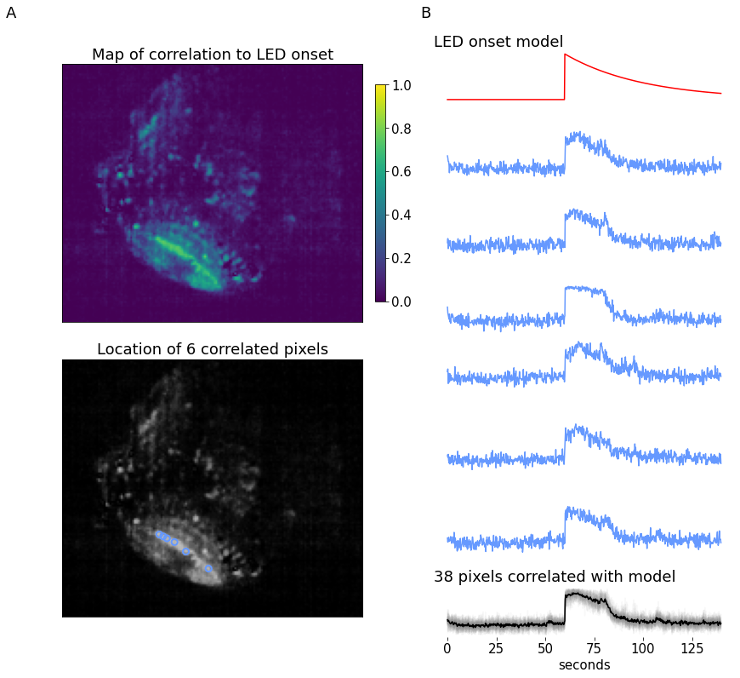
The example (700 frames, 140-second long) data provides a zebrafish experiment where a simple LED stimulus is presented at the 900-frame mark. The recording shows a single plane of the zebrafish brain, focusing on the optic tectum. At the time the LED is flashed, we expect to see an increase in calcium signal within the optic tectum, followed by an exponential decay with a certain time constant that is defined by type of calcium-sensitive fluorescent marker and response parameters. The LED onset model is built using decay constant , and is used to identify which pixels are most correlated to this model using linear Pearson’s correlation coefficient.
The correlation map displays the correlation of each pixel in the video to the LED onset model. The optic tectum is one of the more highlighted regions, which is expected, but we also see some pixels with high correlation in other regions. From here, a subset of pixels with a correlation coefficient ≥ 0.7 are identified (n=38). Figure 8B displays the spatial information and temporal traces from six example pixels from this subset. It might be desired to correlate all other pixels in the video to one single seed pixel; using this same form of analysis all pixel activity can be correlated to one pixel’s activity instead of a model.
In conclusion
Our main goal for this article is to present python code packaged together with data that should help those new to python programming and image analysis. For each task — from loading data to performing clustering and visualization — you can find multiple different solutions. Even here we present several solutions for the same problem. You can find even more ways for similar visualization and processing in published papers (and unfortunately here we cited only a fraction of great examples). Please feel free to download the data and code (DOI 10.22002/D1.20282) and use it as a “sandbox” to get more comfortable with scripting. If code breaks, you can always download it again.
 (13 votes, average: 1.00 out of 1)
Write a ‘How to’ post
Create an account or log in to post your story on FocalPlane.
More posts like this

Filter by
- NewsApply
- DiscussionsApply
- How toApply
- ToolsApply
- Case studiesApply
- InterviewsApply
- JobsApply
- EducationApply
- Blog seriesApply
- Asian Microscopists ..and Cell BiologistsApply
- AIC at HHMI JaneliaApply
- Deep Learning for Bi..o-image analysisApply
- GloBIAS – updates fr..om the communityApply
- WAMBIAN: West Africa.. in FocusApply
- Volume EMApply
- Latin American Micro..scopistsApply
- Bio-image Analysis w..ith NapariApply
- Imaging with…Apply
- Towards Global Acces..sApply
- Latin America Bioima..gingApply
- From Zero to Qupath ..HeroApply
- Highlights from Euro..-BioImagingApply
- LSFM seriesApply
- DIY MicroscopyApply
- View all