Explorative image data science with napari
Posted by Robert Haase, on 23 May 2022
When analysing microscopy image data of biological systems, a major bottleneck is to identify image-based features that describe the phenotype we observe. For example when characterising phenotypes of nuclei in 2D images, often questions come up such as “Shall we use circularity, solidity, extend, elongation, aspect radio, roundness or Feret’s diameter to describe the shape of our nuclei?”, “Can we safely exclude the small things from the analysis, because these are actually no nuclei?”, or “Which features identify mitotic nuclei better, shape-based or intensity-based features?”. These questions can partly be answered by inspecting carefully how these features are defined and how objects appear. However, in the age of computational data science, there are other approaches for exploring measured features, their relationships with each other and relationships with observed phenotypes. The techniques I’m writing about are established in life sciences for years, e.g. in tools like CellProfiler/Analyst and Pandas, and typically require large amounts of imaging data and/or coding skills. Versatile, interactive image data exploration tools were lacking for exploring features in single, potentially timelapse microscopy datasets. My team and I are bringing such tools to the napari ecosystem to facilitate answering questions as listed above and to streamline image data analysis in general. If you, at an early project stage, can get an idea how extracted features relate to each other and where in your image you find certain patterns, downstream analysis can be much easier.
| Features are quantitative measurements which can be derived from entire images or from segmented images. The process of deriving features from images is called feature extraction. The result is typically a table with columns such as “Area”, “Mean intensity”, etc. In Python there exists also a defacto-standard column “label” that tells us which object the measurements were derived from. |
| In explorative data science we analyse entire datasets or subsets of large datasets searching for patterns. If those patterns can be identified they lead to new hypotheses that can be further elaborated on using the scientific method and further experiments. Explorative methods typically do not lead to final conclusions such as “Objects are significantly larger under condition A compared to condition B”. Explorative data scientists more often conclude like “The volume parameter is a worthwhile candidate for further analysis because it appears to differentiate conditions A and B”. |
In this blog post we will explore the “Human mitosis” example dataset of scikit-image which originates from Moffat et al (2006). Our goal is to identify mitotic nuclei among others. These nuclei appear brighter, smaller and more elongated, but it is not obvious which feature(s) allow stratifying the nuclei in two groups best.
We will use the plugin collection named devbio-napari. If you want to follow the procedure, it is recommended to setup a conda environment first, preferably using mamba. From within a terminal window with the conda environment activated, we can start napari by typing napari and hitting <Enter>. Its File > Open Examples > napari > Human Mitosis menu gives us the example image we will be exploring in this blog post.

Nuclei segmentation
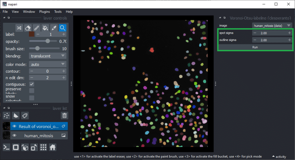
After opening the dataset, the first step is to segment the nuclei. For this we use an algorthm named Voronoi-Otsu-Labeling. You can start it from the menu Tools > Segmentation / labeling / Voronoi-Otsu-Labeling. (Note: In an older version of this blog post we used StarDist for this, which deals with dense nuclei better). In this dataset, you can use the default parameters and just click on Run.
Feature extraction
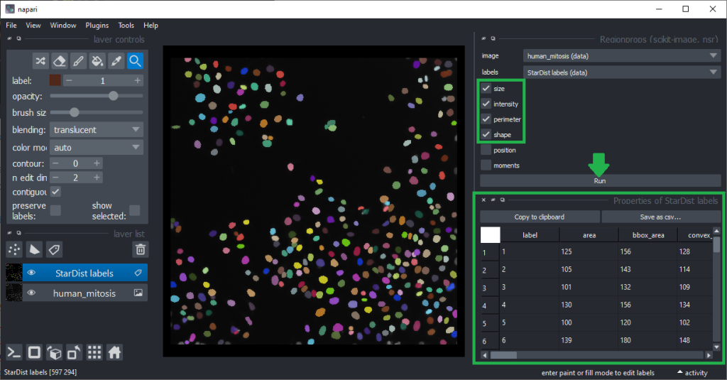
For determining which features are good predictors allowing to differentiate mitotic cells from others, we first need to derive the quantiative measurements from the labeled nuclei. This feature extraction step will be performed using the napari-skimage-regionprops (nsr) plugin which is based on scikit-image’s regionprops_table function. It additionally allows some quantiative measurements such as standard_deviation_intensity, aspect_radio, roundness and circularity users may know from ImageJ. It can be found in the menu Tools > Measurements > Regionprops (scikit-image, nsr). This plugin delivers reliable results in case of two-dimensional images. When working with 3D data, plugins such as napari-SimpleITK-image-processing are recommended. We presumed already above that intensity and shape might be good features and thus, we activate those checkboxes, together with size and perimeter before hitting the Run button.
The column headers in the table can be double-clicked to generate parametric images visualizing the values in the column as coloured overlay in the image.
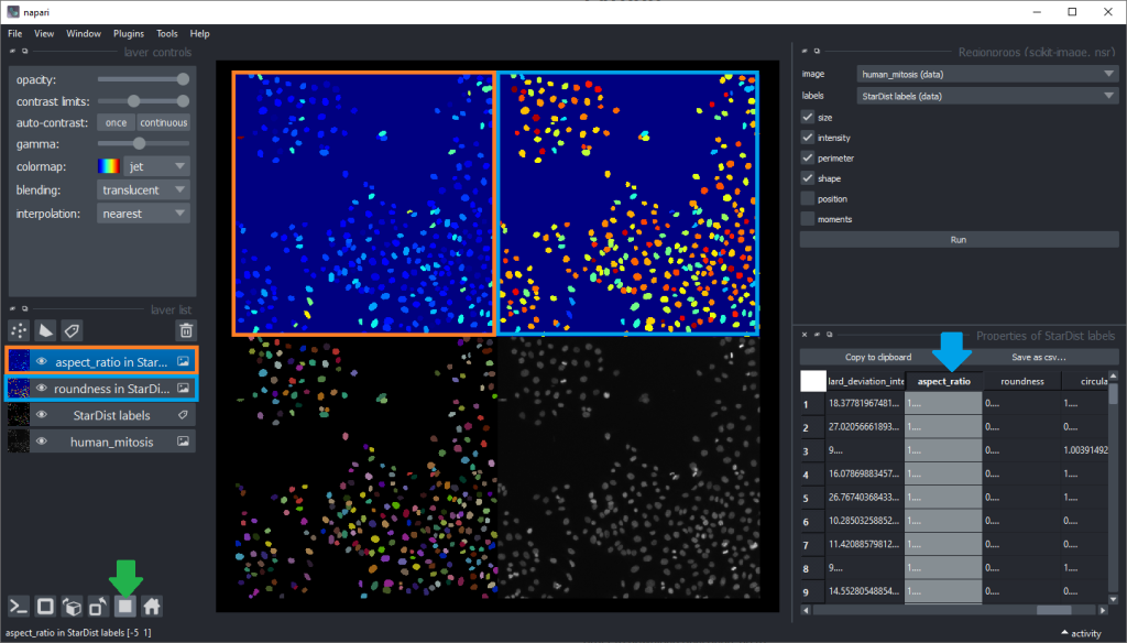
Inspecting these parametric images for a while may give an idea which shape descriptor features are well suited for differentiating mitotic cells from others. But visual inspection in this way is limited. Before going further, we clean up our napari window a bit by closing the regionprops and table panels on the right, and closing the two parametric images by clicking the small trash bin icon on top of the layer list. We can also switch back to the non-grid view.
Dimensionality reduction
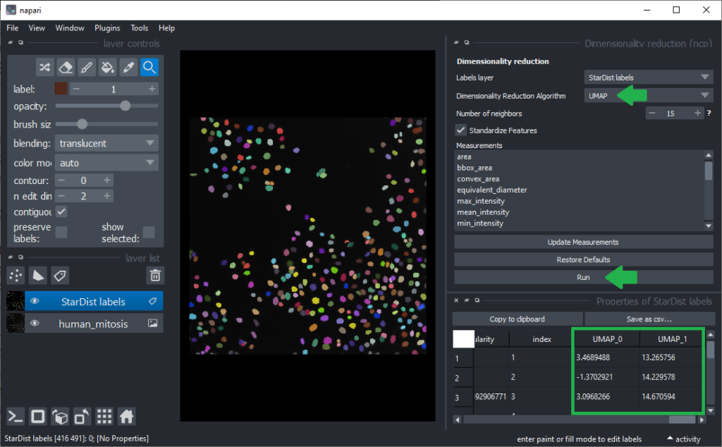
To determine more robust hypotheses for which features are best suited for making this decision, we will use advanced data exploration methods as provided by the napari-clusters-plotter (ncp) plugin. To use it, we click the menu Tools > Measurement > Dimensionality Reduction (ncp). It allows us to use the Uniform Manifold Approximation Projection (UMAP) technique.
| Dimensionality reduction is a technique for reducing the number of descriptive parameters of objects to ease inspection of relationships between data points. We commonly use dimensionality reduction techniques to reduce high dimensional parameters spaces (tables with many columns) to produce e.g. two new columns that contain as much information as possible from the other columns but can be visualized in 2D scatter plots. |
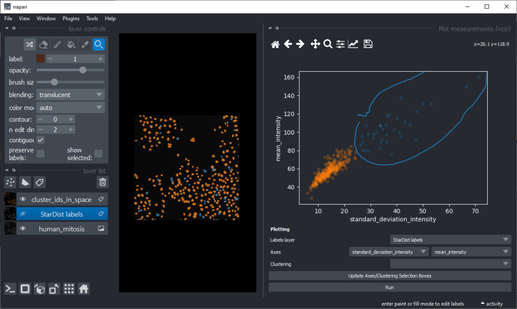
As inspecting UMAP features / dimensions is not very intuitive in the table view, we close these two panels on the right again and click the menu Tools > Measurements > Plot measurements (nsr). This user-interface allows to plot freatures against each other, e.g. UMAP_0 versus UMAP_1.
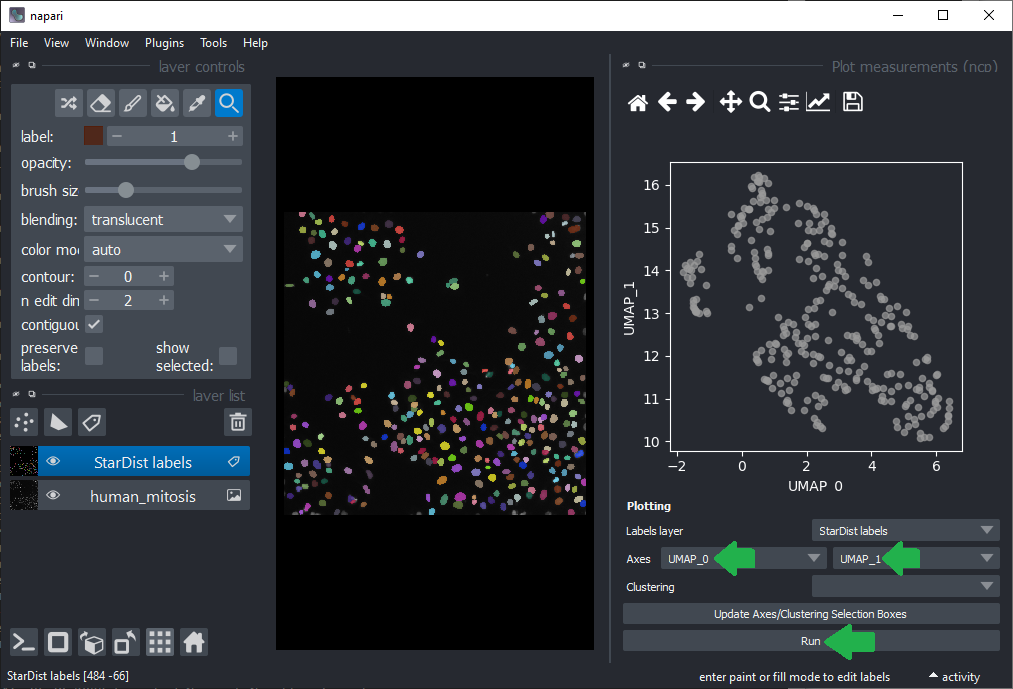
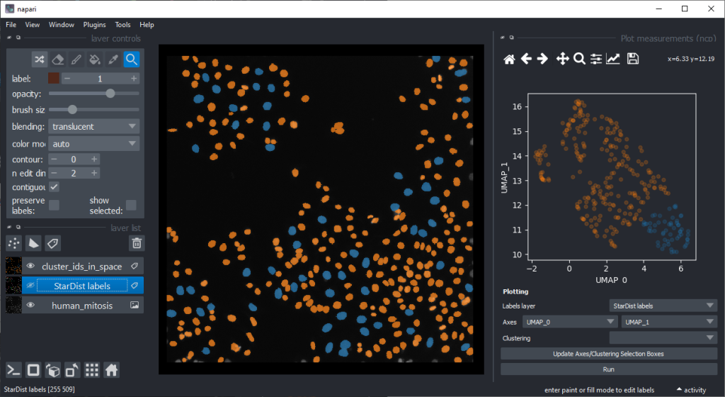
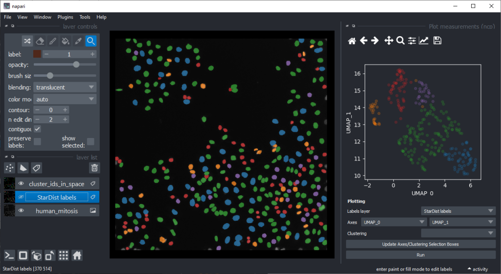
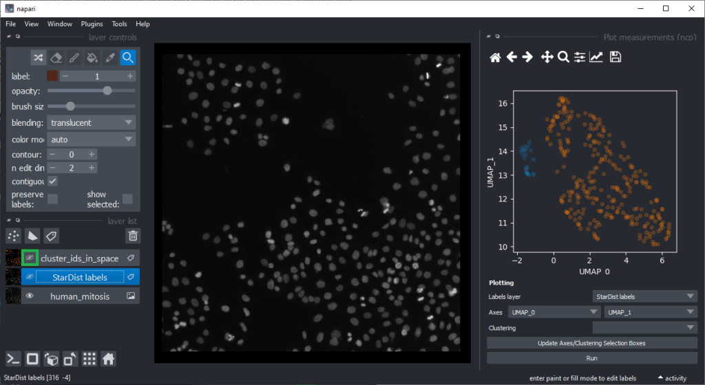
By annotating different regions in this scatter plot, we can get an idea of what kind of objects the regions in UMAP space correspond to.
If mitotic cell nuclei are appear smaller, we could hypothesise that area is a good predictor for performing the nuclei classification.
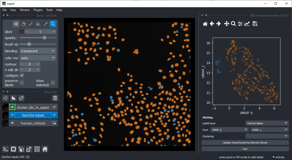
By the way, if we would separate the regions in the UMAP automatically, e.g. using cluster analysis, we would perform unsupervised machine learning. Many techniques for this are popular these days. We stick to manual annotation this time and we are aware that we introduce a bias when annotating data points by hand.
Plotting features against the UMAP
To explore our hypotheses that differentiation may be feasible using features such as area, we can now plot the area against UMAP_0.
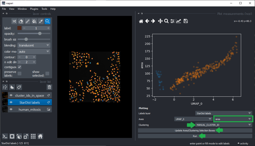
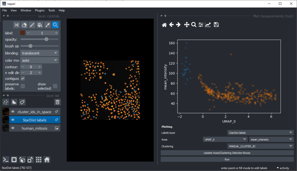
From this perspective it appears muchh more reasonable that intensity based features are better suited for nuclei classification.
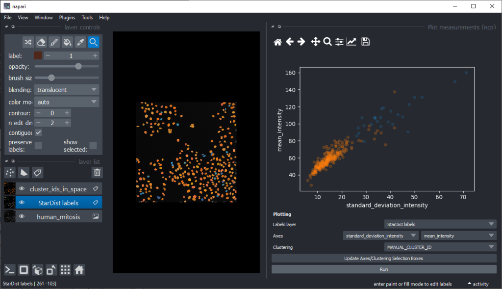
There are orange data points in the standard_deviation_intensity versus mean_intensity plot with high values we might want to explore deeper to see which nuclei these correspond to.
Supervised object classification
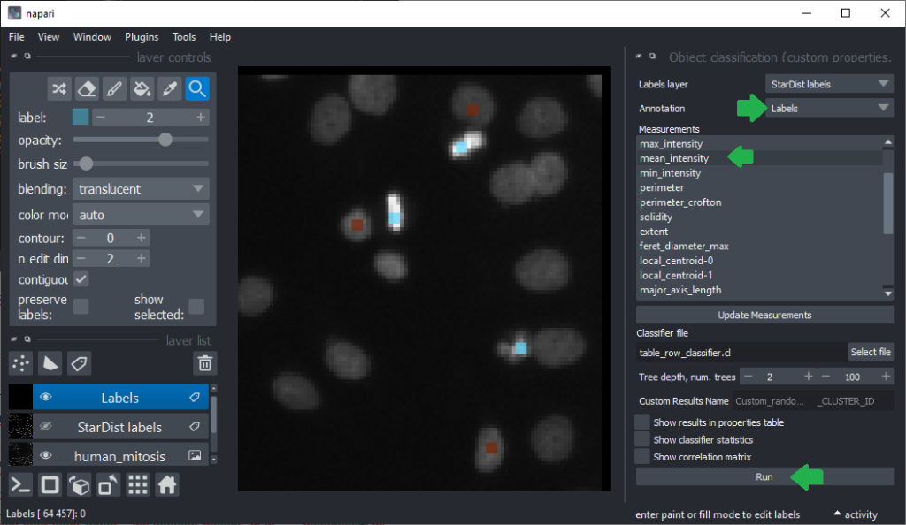
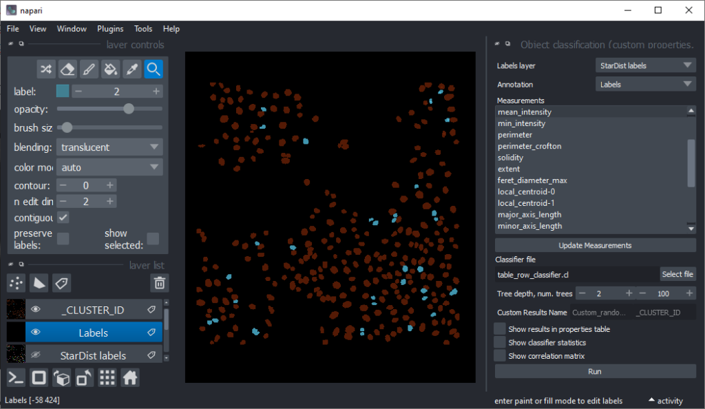
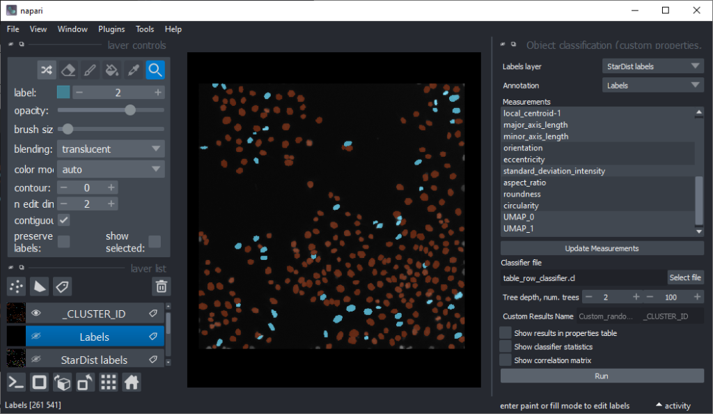
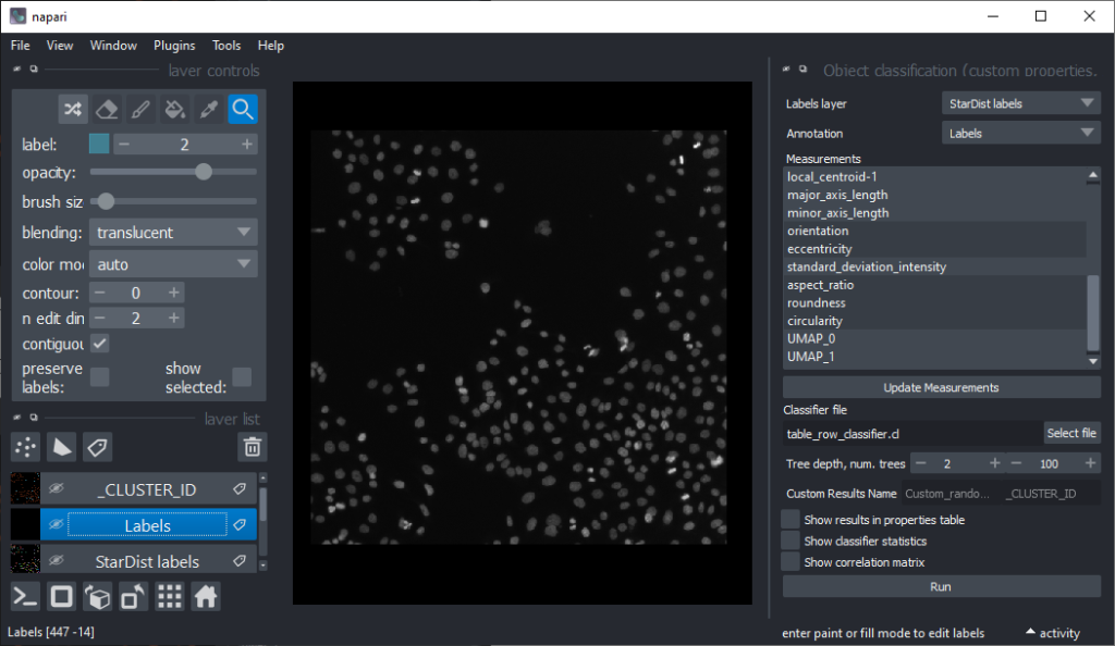
Now that we have an idea which features allow to differentiate the nuclei, we can use Random Forest Classifiers, a supervised machine learning approach to classify the objects as mitotic or not. We use the menu Tools > Segmentation post-processing > Object Classification (custom properties, APOC) for this. For classifying objects in a supervised fashion, we need to provide a ground truth annotation. Therefore, we add another labels layer and draw with label 1 on top of objects that appear not mitotic and with label 2 on mitotic nuclei. It is not necessary to outline the nuclei precisely as the segmentation of the object are provided by the layer we created earlier using StarDist. In this step it is only necessary to touch the annotated objects with the annotation.
Next steps and further reading
All the steps we performed serve data exploration. We did not even attempt to proof any hypothesis. It might be possible to reuse the trained classifier potentially also for processing other datasets, but we did not elaborate on classification quality. The classifier is not validated. All the methods shown above serve data exploration and conclusions must be handled with care. The tools serve more to build up a model of relationships between features in the head of the end-user sitting in front of the computer. Also all tools we showed are in experimental developmental phase. Some napari-plugins have a Status: Alpha button on their napari-hub page highlighting this. Typical stages are pre-alpha, alpha, beta, release candidate and stable release. Read more about developmental statii of software to learn what happens in the different phases of software development. I just would like to highlight this is all experimental software, so please treat results with care.
Until we developed napari-plugins for validating classifiers and for measuring segmentation quality, we need to stick to other tools such as jupter notebooks for validating our methods. Thus, at this point we have to point to other resources
- Segmentation algorithm validation
- Quantitative label image comparison
- Cross validation using scikit-learn
- Classifier validation
- StarDist training and model evaluation
- Training classifiers from folders of images
Feedback welcome
Somoe of the plugins introduced above make tools available in napari which are commonly used by bioinformaticians and Python developers. We are working on making those accessible for a broader audience, aiming in particular at folks who like to dive into feature extraction, feature visualization and exploring relationships between features without the need to code. Hence, these projects rely on feedback from the community. The developers of these tools, including myself, we code every day. Thus, making tools for explorative image data science that can be used without coding is challening. If you have questions regarding the tools introduced above and/or suggestion for documentation or functionality, that should be added, please comment below or open a thread on image.sc for a more detailed discussion. Thank you!
Acknowledgements
I would like to thank the developers behind the tools presented in this blog post which were mostly programmed by Laura Žigutytė, Ryan Svill, Uwe Schmidt and Martin Weigert. This project has been made possible in part by grant number 2021-240341 (Napari plugin accelerator grant) from the Chan Zuckerberg Initiative DAF, an advised fund of the Silicon Valley Community Foundation. I also acknowledge support by the German Research Foundation (Deutsche Forschungsgemeinschaft, DFG) under Germany’s Excellence Strategy – EXC2068 – Cluster of Excellence “Physics of Life” of TU Dresden.
Reusing this material
This blog post is open-access. Figures and text can be rused under the terms of the CC BY 4.0 license unless mentioned otherwise.
 (8 votes, average: 1.00 out of 1)